Wednesday, September 28, 2011

Personalized backgrounds paper for layouts

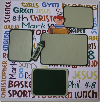
Oh my goodness, I was so excited to do this layout for my friends who come to my class. Although it was a lot of work to do each of them, I think everyone liked them. Each one emailed me with their child’s name, teacher, grade, favorite color or any other information they wanted on the page…I then used my most favorite tool in scrapbooking and that is Make the Cut, and created their background pages. I then used one of my favorite diecuts from Treasurebox Designs, the little Pocketpal kids, and her school supplies, I believe this is from School Days, or Back to School pattern pack.

My layout that I made is of my son Chris, this is very special to me as we don’t have many pictures of him in the 8th grade as he passed away shortly after the school year began in his gym class from an unknown heart condition called Hypertrophic Cardiomyopathy or HCM. This is a hard time for our family as it is now 10 years since he’s been gone, and so I hope that if you are reading this, that if you have children, that you mention this condition to your pediatricians and have your child screened. This is also known as the “silent killer” because our children never get screened, nor can doctors tell about this condition unless Electrocardiograms are done. We never knew he had a heart condition, and I’m a nervous Nelly, always took my children to the doctors for any ailment they had.

I’m hoping anyone reading this page that this would be just another way to bring awareness, make sure your schools and gyms have AED’s, and if they play sports, get them screened. Ok, here’s the layout, Enjoy!

IMG_7999IMG_7998

Thursday, September 22, 2011

OOPs

So last week I posted a layout with a school theme READING, WRITING, ARITHMETIC! I then wanted to add this weeks layout to it, and by mistake, I totally erased the whole post uggghh! Your comments are still there, but with a totally different post.

I had written that it had been a while since I had scrapped because of going through some difficult times. Last June I lost my mom and it was such a sad, hard time for me. Then we were worried about my dad, being so far away from all of us and being alone. Then my dad was diagnosed with Cancer and a very bad heart, and things went so wrong so fast. He was diagnosed in February, and he died in April. Less than a year apart, I lost both parents. I miss them so much. I just didn’t feel like doing anything for so long. We have had such a horrific year, with some other tragedies in our life that scrapbooking or any type of crafting just didn’t feel right. Then the first of July we received a phone call and they had found my mother-in-law dead, she died in her sleep. We have just been so numb with all the losses in our lives in such a short amount of time. Due to where family members live so far apart, we didn’t even get closure to losing our loved ones until this past August. I think our parents would’ve loved the services that we held in honor of them. We shared laughter and tears together. I am so blessed to have such a wonderful family and friends who have been there for me and for all of us. Our Church was there for us also, we thank them for their prayers and for gifts of food and for coming to help us say our goodbyes or rather we’ll see you soon to our parents.

But last week, I decided it’s time to get back into it and be around my friends. Although it so happened that no one was able to attend, I sat down and did the layout, and felt so good when I got it done. So here again is the layout, Enjoy

Wednesday, September 14, 2011

Another Layout for Back to School with Treasurebox Designs

This was another fun layout that I did this week using one of my favorite cut files from Treasurebox Designs….I love the details that Dina puts into her designs. I also love, love the new face stamps, so my girls don’t have to draw the faces anymore, they just don’t like to try drawing them, and if I use the cut out pieces, I tend to lose them and have to cut extras. I just love the ease of stamping the face, but with that said, I also like the piecing of the face to give it some dimension also. So here’s this weeks layout using TBD file,  Enjoy!

I am going to add photos in the bus window of my children so they look like the driver of the bus Smile

MTC 3.3.3 released!!

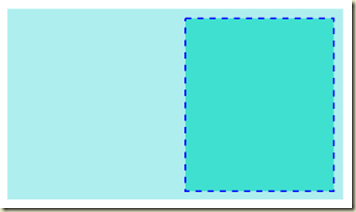
The new MTC 3.3.3 version is released! I have been using it for well over two weeks now and I have to say, I LOVE IT! One of my favorite features is the ability to have lines turned into dashed lines, why I like this feature you ask? I can create a small shadow around my object and turn it to dash lines and put my pens in my cricut and now I have faux stitching. This would be nice for cards or layouts where you would use your gel pen and now your lines would be perfectly spaced and sized.
image
The new update will still work with your Cricuts as long as your previous version was 3.2.1.
Another neat feature is the link to Lettering Delights, now all the files you own can show up when you click on the icon. If you have to purchase, you can either use my links or you can purchase within the software and a small fee will go to Andy who is the creator of MTC.
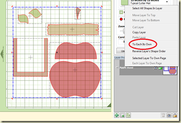
Another wonderful feature is that if svg files are created in color, most of them will now open up in MTC in color now and all you have to do is send them to their own layer, so much easier.

image

To do this, click on the layer box so that it selects all the items, then right click, TO EACH IT’S OWN, this will put all the reds in one layer, all the browns in one layer etc…this file is from http://treasureboxdesigns.com her new file Bushels of Fun.

Another new feature is when you choose your fonts, you can now see the style by checking the  show face box…this makes it easier to do your text and find the font that you want. This is a feature I like especially for doing my vinyl wall designs, Andy didn’t really like the idea of having this feature, but It has been requested by quite a few people so I think that’s how it made it in the new update. He has the option of checking the box in case you don’t want to view the font.

You can view the fonts as they will appear without having to constantly click on the font to view it.  Just click on a button and "show face" and as the fonts show up on the drop down menu they show up as they would appear.  You can also edit right in the texting box, either by line, space, you can split right there before placing it on the mat.

  Now one less thing I have to create in another program before importing it to MTC.